

Input, Process or Output? Choosing the right KPI
Erich Pelikan – 11.11.2024
Simple question, but no simple answer
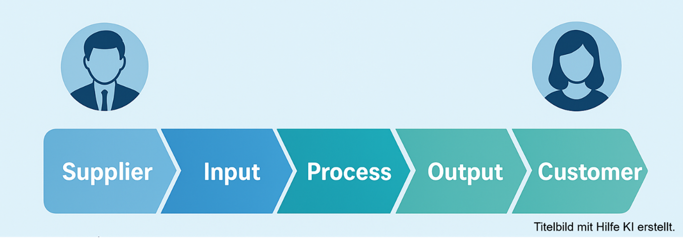
In my last training session on Performance Dialog implementation a participant asked me if there are any criteria for “good” KPIs? I sketched the picture below on a flip chart and explained that he should use KPIs from all three areas (Input, Process and Output) of the process to get the full overview.

Every trainer knows that dry theory needs simple examples and you must have one in your pocket to build the bridge towards real life. The retained nodding of the participant told me that this is such a moment of truth. So I shared this story:
Think about a manager and a controller talking about leave entitlement somewhere in May of the current year. The manager knows that everyone in his team had a slight carry over of a few days from last year and every team member gets a grant of “new” 30 days in January. The goal is, that employees use all vacation days during the year with a max of 2 days carry over. Now the controller looks into his data and tells the manager, that there is on average a leftover of 25.2 days per team member, which leads to building an accrual and results in a budget hit in the staff cost section. The manager looks into his data and says “no, you are wrong, my team has already booked the vacation days in the system and there are only 7.8 day left unassigned on average, which is pretty much the Xmas period. Summer, where most people go on vacation, is still a month away, that’s why we have the gap. Your action to build an accrual is not considering all facts”.
Who is right?
If we put this in a graph things become clearer:
- Let’s start with the input data which is carry over plus new grant (red and green dots). This is our springboard.
- Now we have already taken vacation (yellow line – what the controller uses) and booked vacation (blue line). This is both process data. The difference is the remaining vacation entitlement, which is shown in the graph by the numbers added to the blue line. This is process data too. However, a controller might extrapolate the yellow graph and calculate some 220 days left at the end of the year based on the current slow reduction path.
- The taken vacation is output data, but it is only relevant after 12 months. If yellow line and blue line would almost match, the manager would be in trouble.
- But what is a good or healthy path? That is represented by the red dotted line – the average decline of vacation entitlement based on data from previous years and adjusted to a seasonal pattern. As long as the blue line is on the left of the red line, we can assume that we will reach our goal at the end of the year.
- Our management window (how often we look at the data) should be the process duration (12 month) divided by 20: it would best, if we would check this data every 2-3 weeks to have full control over the process. Probably a monthly review might still be ok.
![]()
Both are right, depending on their role and perspective.
The manager has trust that the team will use the vacation (based on the booked days in the system), the controller sees a risk, that employees cancel the vacation (but how likely is it, that the entire team cancels their vacation plans, except for pandemic situations?). Putting this data into a graph creates the necessary common ground for both to come to a joint view.
Data can tell us a lot, when we understand its nature and find ways to combine different perspectives in a simple but expressive picture. Looking at just one side might lead to wrong conclusions (and bad decisions).